-
首頁
-
new訂閱制數位訂閱制 Ivy Engrest 介紹 數位訂閱制 Ivy Engrest 新手攻略new數位訂閱制 優惠方案 註冊享免費體驗 7 天,再送 $200
-
看文章登入註冊難度 收藏文章

俗話說得好:「一張圖片勝過千言萬語。」
>> 翻開覆蓋的籤紙 大獎小獎靠自己Draw Fair, Win Rare in Ichibankuji
文章主講 Angela, Wesley
“A picture is worth a thousand words , ” so goes an old saying . It’s so much easier to point to a destination on a map than to speak or write out driving instructions. Similarly, most charts and graphs are infinitely easier to understand and remember than even the most careful description. Since we live in a world of statistics , we should know how to use these visual aids.
Graphs typically use lines or bars to express data. A line graph, for example, may be a continuous or dotted line on a two-dimensional background showing changes over time, such as the value of a currency, population growth, weekly temperature forecasts , etc.
The bar chart uses either vertical or horizontal 6 bars to show comparisons among things. The information being analyzed is represented on an X axis and a Y axis. One axis represents categories, while the other represents the value or number of each category.
Charts are also used to show important information. A common one is the pie chart. As its name implies, a circle represents a whole category. Slices of the “pie” represent the size of each portion of the whole. For example, 50% of a category would be represented by one half of the circle, with smaller amounts shown as thinner slices.
The radar chart is another visual representation. More complicated, radar charts compare different members of a set based on different variables . For instance, one can compare a dozen different refrigerators according to variables such as size, price, electrical consumption , etc. Trained researchers can quickly identify areas of similarity and difference among the variables.
Most charts and graphs are easy to use and understand, just as a photograph gives a clearer understanding of its subject than a written description of it.
1. What is the main idea of this passage?
(A) Visual representations are usually easier to understand than descriptions.
(B) Pictures can provide more meaningful data than graphs or charts.
(C) Understanding statistics requires high levels of mathematic ability.
(D) Only trained specialists can understand graphs.
2. How is the information organized in Paragraphs 2 to 5?
(A) In order of importance.
(B) By classification.
(C) By problem and solution.
(D) In the sequence of events.
3. According to the passage, which of the following statements is true?
(A) Graphs are easier to understand than charts.
(B) Charts are easier to understand than graphs.
(C) Line graphs are more commonly used than pie charts.
(D) The radar chart is more complex than the other described visuals.
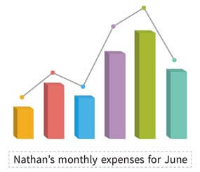
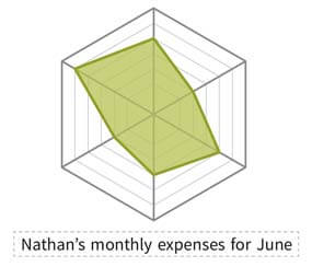
4. Below are Nathan’s monthly expenses for June. If he would like to see the proportion of each category, what chart should he use?
Food & Drink: NT$8,254 Entertainment: NT$845 Rent: NT$4,500 Transportation: NT$1,280 Cellphone Bill: NT$980 Savings: NT$3,000 (A) (B) 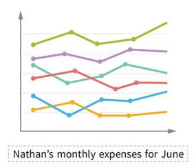
(C) (D) 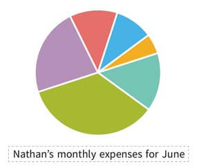
★ 中文翻譯僅供參考,請勿逐字逐句對照
俗話說得好:「一張圖片勝過千言萬語。」在地圖上指出一個目的地要比用說的或寫出行車指引來得容易多了。同樣地,即便是最仔細的敘述,都遠遠比不上多數圖表來得容易理解和記憶。既然我們活在統計數據的世界,我們就該知道如何使用這些視覺輔助。
圖表通常使用線條或長條來表示資料。舉例而言,折線圖可能是繪製在平面背景上的連續直線或虛線,顯示了隨著時間所產生的變化,像是幣值、人口成長、一週氣溫預報等等。
長條圖使用垂直或水平的條塊來顯示項目間的比較。被分析的資訊呈現在 X 軸和 Y 軸上。其中一軸代表類別,另一軸則代表每個類別的數值或數量。
圖表也被用來顯示重要資訊。其中一個常見圖表是圓餅圖。圓餅圖就如其名,一個圓代表整個類別。這塊「餅」的切片代表每一份在整體中占有的比例大小。例如,一個類別的 50% 會用該圓的一半來代表,更小的數量則會用更薄的切片顯示。
雷達圖是另一種視覺圖示。雷達圖更為複雜,根據不同變項來比較同一組中的不同成員。例如,雷達圖可以根據像是大小、價格、耗電量等變因來比較許多不同的冰箱。受過訓練的研究人員能夠很快地分辨這些變因之間的異同處。
大多數的圖表都很容易使用和理解,就像一個主題的照片會比文字描述更能讓人了解該主題。此時應是夏季。
1. 本文主旨為何?
(A) 視覺圖示通常比敘述要更容易理解。
(B) 圖片比圖表更能提供有意義的資料。
(C) 了解統計數據需要很高程度的數學能力。
(D) 只有受過訓練的專家可以了解圖表。
2. 第二段到第五段的資訊是如何組織的?
(A) 依重要性順序。
(B) 依類別。
(C) 依問題和解決方法。
(D) 依事件順序。
3. 根據本文,下列敘述何者正確?
(A) graph 比 chart 更容易理解。
(B) chart 比 graph 更容易理解。
(C) 折線圖比圓餅圖更常被使用。
(D) 雷達圖比其他文中提及的視覺資料更複雜。
4. 下方是內森六月的月花費。如果他想要了解每一類的比例,他應該使用哪一個圖表?
飲食:NT$8,254 娛樂:NT$845 房租:NT$4,500 交通:NT$1,280 手機費:NT$980 儲蓄:NT$3,000 題解: (A) 折線圖是表示某物隨著時間的變化量,但此處只有六月的花費,無法繪製也無法看出比例;若使用 (B) ,該折線圖及長條圖呈現的會是六類花費彼此的高低起伏,沒有意義;(C) 圓餅圖可呈現每一個類別占所有花費的比例,故選之;(D) 雷達圖是用來比較同類型不同物品的特性,亦不適合。
Ans: 1. A 2. B 3. D 4. C
>> 翻開覆蓋的籤紙 大獎小獎靠自己Draw Fair, Win Rare in Ichibankuji
延伸閱讀
關鍵字: #閱讀測驗
本篇內容出自《常春藤解析/生活英語雜誌》,
2026/08/16 00:00 前買享優惠Ivy Engrest 訂戶在訂閱期間訂閱紙本(無贈品版本)再享最低 62折優惠!)>>
【雜誌訂閱】MORE&MORE
回饋與建議
為了提供更好的閱讀體驗與學習感受,有任何建議或問題歡迎留言讓我們知道,感謝~
英文問題僅回答您對本篇文章的疑慮(發現單字拼錯、文法有問題)等,其他延伸問題恕不提供回答服務。謝謝。學會了嗎?✋來答題得 熊贈點~
恭喜答對獲得 熊贈點 1點
答
題
賺
點
數作者

Bruce E. Bagnell
常春藤解析英語雜誌資深外籍教師,中英文流利,曾為台灣大學資深教授,與賴世雄老師為多年好友。